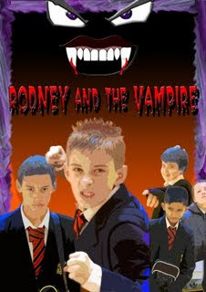
Draft 1 - Poster


This is the first poster Duniya made using Adobe Photoshop. We used a faded, purple border around the edge of the poster in order to create a spooky, mysterious effect. Purple is also associated with mock horror. We situated cartoon eyes and vampire mouth at the top of the poster in order to create a comical, cartoon style aimed at children as it is something that we thought would catch their eye. It also shows the halloween side to our film. Rodney and the Vampire is written in the center of the poster as it is one of the most important things. We chose to write it in a spooky styled font in the colour Red. This would attract our target audeince of children as well as showing it is not seriously scary and has the theme of 'mock horror'. We then put images of our cast at the bottom of the poster onto a orange background (main colour associated with halloween). We had each character strike a pose which represented their character in an obvious way as it is targeted at children. Rodney is the biggest image as he is the main character surrounded by our 'possey'. The fact that their are 3 children on the right pointing and laughing at Rodney suggests the film will be very comical, however the fact that Danny is situated on the left of Rodney shows he holds more importance in the film. Rodney strikes a comical 'fighting pose' as if he can take anything on so the audience gathers he is a bit of a 'geek' and made fun of. The images of the characters has a cartoon effect on them to blend in with the rest of the poster and the theme of the film.

Feedback:

After showing this poster to fellow classmates we recieved feedback that we needed to add title, credit block, tagline and credit block.


I think we could use eyes at the top of our poster to represent Mr Vampings eyes, however, i would replace the red with purple so it is not to threatening as our story is only mock horror


While searching for fonts suitable for my poster on halloweenfonts.com i found one which i thought suited our fim poster. The font style is very 'spooky' yet childish. I also found the colours very well related to our poster as the purple, red and black all relates to the theme of halloween we are trying to portray through our poster.

Font ideas for poster


I found this font whilst researching on the internet and think it would be ideal for our film poster. It has a very spooky feel to it with the red and black but at the same time the font indicates immaturity and 'scaryness' for kids.

Film posters that inspire my own film poster


I chose the film poster of 'Son of Rambo' to look at for inspiration for my own film poster as I get the same feel from this poster as i would like my own poster to have. I like the fact the boy is in the foreground in a silly costume with goggles and a 'weapon'. This immediately tells me that this is an immature, young, foolish boy who believes he can 'fight' and take things on by himself. His funny costume creates comedy and shows the gullable, stupidity of him. This is exactly how i would like Rodney to be portrayed in our own poster. I would like him too to be in the foreground with his garlic necklace and carrot stake. This gives the same impression, however, with a halloween edge. I would like my film to be thought of as 'Son of Rambo' -Halloween Style!
I would use more blacks and oranges in my film to portray the theme of mock horror and halloween for kids.


I also found inspiration in the film poster for Mock horror 'Hocus Pocus'. From watching the film i know that this film is very 'halloweeny' and spooky but it is intended for children and young people. From the poster i can tell this straight away from the colours used (black and purple). What also caught my eye in this poster is the black background and purple border around the edge. I had previously had an idea to use this in my own film poster, however, i wanted to make the purple border misty and smokey to create mystery as well as showing the target audience of children. This is something i will take into consideration when i do my film poster as i think it works well as proved in the film poster of 'Hocus pocus'. We can also tell from this poster that the 3 main characters in the main image are evil but in a light way. For example, it is evil on a childrens level. Their quirky, posed facial exporessions also give away some humour behind the characters which is how i feel Mr Vamping should be portrayed in my poster.


I liked the eyes on the book cover for 'The Demon Headmaster' as it gives a freaky, spooky feeling when you see it. I would like to use this idea for Mr Vamping as i feel having his eyes on the top of the poster would be very effective if teamed with some comedy too.

Possible Taglines


Whilst working on our poster we began to think of some ideas for our tagline:

-Not all teachers bite
-What if vampires were real
-Rodney bites back!
-Not your average halloween


From an exercise in lesson we gained feedback from our class members after we describes to them the world of our film:

We are making another simple kid story featuring a young, gullable, annoying little boy. This hyperactive boy is intended to entertain, create laughter to children based on his stupidity and naievity. The simplicity of the film is something we want to get across through our poster as well as the childish theme of pranks, fun and schoolboy fun. Some of the main themes we want to portray through the poster is haloween, mock comedy and immiturity clearly stating our target audience of children between the ages of 6-12.

Feedback:
black background, speech bubble surrounding title, Mr vamping in background, SChoolkids laughing at Rodney, red writing, 'Foolish bravery', pumpkins, orange, purple, black, shadow of Mr Vamping, silhouette of buildings with Mr Vampings eyes on the top, fangs, blood dripping.

I designed my poster this way as i feel is shows the main messages and ideas we were trying to get across. I used Mr Vamping in the foreground in an exagerated pose with his hands above his head. This shows that it is not a horror which involves death and an evil vampire, it merely shows the comical side of the story as well as the theme of 'mock horror' for kids. I also situated Rodney behind his desk with a terrified expression on his face. Not only does this show the comical, 'stupid' character of Rodney but it also links in with the School theme as he is wearing uniform attracting children also at school. I put the title in spooky red writing in quite a childish font once again to show the scary theme but portray nothing too serious and show the fun side of the film. I used the colour blue for the background as i feel it matches the atmosphere of the film. It is not too serious but still a mock horror.

Feedback on my poster from discussion with group:

-Typography of title is good- Shows moch horror.
-Body language is comical- shows themes
-Setting is established through costume- School uniform-attracts children(Target audience)
-Rodney should be in the foreground as he is infact the main character
-Need to use more colours that connotate with the Haloween theme e.g purple, black, orange
- Could include symbol of fangs and eyes
- Need to incorporate the message into poster- Fantasy can be reality, anything is possible
-More comedy needed
-Not too scary for target audience of children.